Overview
Chase alerts customers about account activity across 20+ products - from deposits to fraud warnings to identity verification. But customers were overwhelmed: settings were buried 5 steps deep, the UI showed dozens of toggles organized by internal product names, and only 2% of users ever configured their preferences.
As a design lead, I redesigned Communication Settings around a bundled onboarding choice and inbox mental model - shifting from "manage 47 toggles" to "choose your communication style." I shipped a web-first MVP under platform constraints that proved the concept and earned investment for the broader vision.
Impact
The Challenge
Chase sends important messages. Customers rely on alerts for account activity, security warnings,and transaction confirmations. In theory, this helps them stay informed andprotected.
But the experience trained customers to ignore us. Research revealed customers were overwhelmed and disengaged:
- Settings were ~5 steps deep - many customers didn't know where control lived
- The UI felt dense and unclear - too much information, too many options
- Customers wanted a sense of control but couldn't find it
What leadership cared about: This wasn't just annoyance. It risked trust erosion, increased servicing cost, and made customers more likely to miss or distrust fraud/security alerts.
The Pivotal Insight
The problem wasn't "too many alerts" - it was "control is hidden until frustration." Customers weren't failing to manage preferences because they didn't care. They failed because the app asked them to do hard configuration work at the worst possible time - after they were already frustrated.
So instead of improving a giant toggle page, I changed the model: make preference selection easy upfront and make ongoing management feel familiar and trustworthy.
The Design Shift
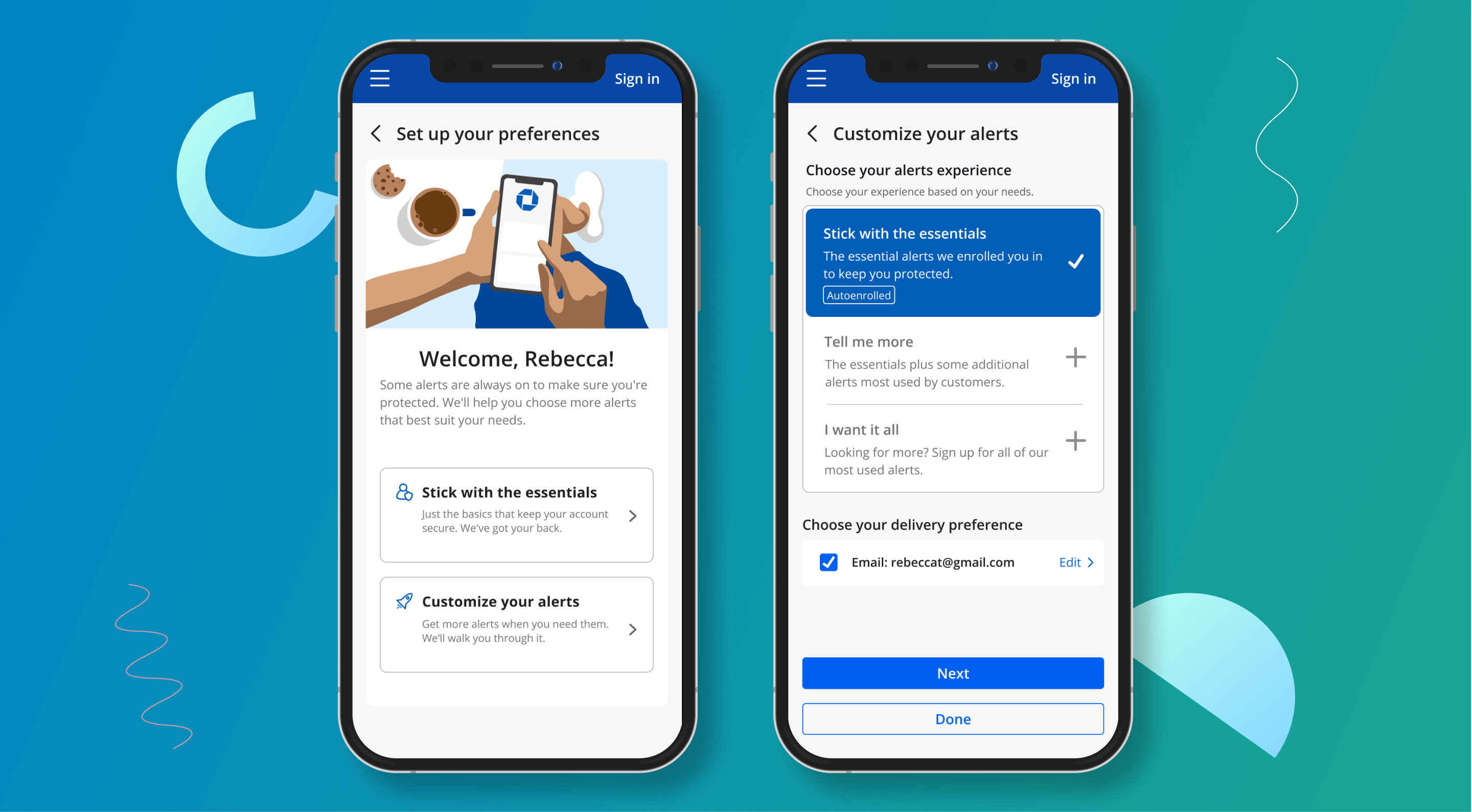
I replaced configuration overload with three clear paths. The new flow offered: "Stick with the essentials," "Tell me more," or "I want it all." This turned an overwhelming settings task into a single confident decision, with room to refine later.
I pushed for an "inbox" mental model. Treat notifications + secure messages more like an inbox, so customers can recognize what a message is and feel in control. Notifications stopped feeling like random interruptions and started feeling manageable.
I protected trust-critical notifications. Fraud/security and non-user-initiated activity (new login/device, suspicious transactions) were treated differently than routine alerts. The goal: reduce noise while preserving high-signal trust.
Scenario 1: Simple set up
What We Shipped
The full native experience required 18+ months. Rather than wait, I got buy-in for a web-first MVP (mobile web within the app) that proved value fast while earning the right to larger platform investment.
Below are sample screens that were part of the MVP delivered in the first half of 2021: